Skip to content


Choosing the wrong color setting before you start a design can ruin your final printed product. A design may look bright and vibrant on the screen of your computer, but printed versions come in different forms. Getting your color mode right is the single most important step for consistent branding across digital displays and real-world packaging.
Let’s look closely at how these systems work and how to choose between them so your designs look great everywhere.
What Does RGB Stand For?
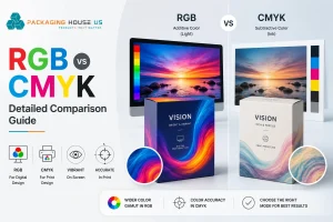
RGB stands for Red, Green, and Blue. It is a standard color system developed specifically for digital screens and uses active light emitters and combines these three colors to project images directly onto your phone, monitor, or TV. These tiny light emitters transmit three foundational colors directly into your eyes.
When you observe closely any electronic panel, you get to know that each pixel uses these three microscopic light elements. Everyday mobile usage demonstrates this reality constantly. By mixing different amounts of red, green, and blue light, screens can display millions of colors.
How CMYK Creates Colors in Print
The packaging industry around the world uses CMYK as their standard color system. It stands for Cyan, Magenta, Yellow, and Key (Black). Printers around the world use this four-color process to manufacture printed paper bags.
Commercial printing presses create colors by placing ink directly onto packaging materials. This is different from computer and phone screens, which generate colors using light. The “K” stands for “Key,” which is black ink. Black plays a major role in print production by adding depth, shadow, and sharp contrast. It is what keeps your text readable and your images clear.
Why RGB and CMYK Matter for Your Designs
It is important to understand how colors are made and how they work. Screens use light to create color, while printers use ink on paper. One builds colors with light, and the other creates them by layering ink on a white surface.
The Additive Process (RGB)
Think about your phone screen when it is powered down. The glass panel is naturally dark and black. Your screen creates images by mixing red, green, and blue light.
When your screen pushes all three colored lights out at full power, they merge completely. Your eyes see the whole mix as pure white light. This system adds light waves on a dark base to create visuals. This is an additive color setup.
The Subtractive Process (CMYK)
The CMYK color model operates on a subtractive mixing method, which is the exact opposite of the digital screens. For this process, we require a reflective base, like a sheet of white paperboard or flat corrugated fiberboard. Some colors of light ink absorb and reflect a specific wavelength of light to create the visuals. Mixing cyan, magenta, and yellow pigments at full strength blocks almost all light, leaving a muddy brown. Because these inks subtract reflected light, it is a subtractive system. Manufacturing teams must introduce that fourth ‘key’ black ink to achieve clean, crisp shadows on custom retail cardboard boxes.
Is RGB or CMYK Better for Printing?
CMYK works well when you need print for physical paper or cardboard. Monitors display millions of vibrant colors that standard press inks simply fail to replicate. Designers call this color range limitation a gamut mismatch.
Commercial printers read RGB files. If you send an RGB design file directly to production, the press software forces an unpredictable, automated machine conversion. This computerized shift flattens your electric blues, punchy magentas, and bright neon greens into muddy, lifeless shades. Setting your project profile to CMYK right from the start locks in color accuracy and eliminates those disappointing post-print surprises
Choosing the Right Color Mode
Matching your setup to the final destination of your design ensures the finished piece looks correct. This prevents the classic headache of color mismatches.
Practical Use of RGB
Select the light-based printing option if your project stays on screens. This applies directly to website banners, social media assets, digital advertisements, email newsletters, and mobile app interfaces. Common projects include
- Web interface
- Social Content
- Screen Media
Practical Use of CMYK
Choose the ink-based printing option for anything destined for a physical press. This covers business cards, brochures, flyers, clothing, and custom packaging like paper bags. Projects that use CMYK are
- Business Stationery
- Marketing Material
- Custom Retail Box Printing
For a deeper understanding to make your print colors more attractive, head over to our detailed breakdown on the Psychology of Color in Packaging.
File Formats for Each Mode
Different file extensions fit either screens or industrial printing machinery. The right format preserves your quality.
- For Digital (RGB): Use JPEG or PNG. JPEG files are small in size, but they provide clear details. Keep your design in PNG files when your web layout requires a transparent background.
- For Print (CMYK): Use PDF or EPS. PDF files keep the design with high resolution and lock your graphics in place. EPS files are the best choice for larger signs and logos, as they can be scaled without losing quality.
How to Convert Your Files
If you start a project in the wrong setting, you can switch the file inside standard design tools.
- In Adobe Illustrator: Go to the top menu, click File, hover over Document Color Mode, and pick your setting.
- In Adobe Photoshop: Go to the top menu, select Image, click Mode, and choose your option from the list.
- Check for Shifts: Once you add the changes, then check the details of the design from start to end to ensure accuracy. Blues, purples, and deep greens can fade during printing.
- Fix Tones Manually: Adjust the ink percentage accurately to match your brand guidelines before exporting the final design file. If any colors appear dull or flat, fine-tune the individual color sliders until everything looks right.
How to Prevent Color Printing Errors
Analyzing physical print colors by looking at a screen is a common mistake. Monitors use backlighting to make artwork look brighter than it will ever appear on flat paper or thick cardboard. To ensure accuracy, check out a physical color chart system with Packaging House US to ensure visual uniformity across your product line. These booklets show you exactly how a specific ink mix looks on coated or uncoated paper before you start a full production run.